Google for Nonprofits
Lead UX Design . UX Research . Project Management . 2019
Google for Nonprofits, a program at Google that was established over a decade ago, helps nonprofits gain access to Google products and services at discounted rates. It empowers over 300,000 nonprofit organizations in 51 countries, to successfully use Google products by providing nonprofit focused training, resources, and tools.
I joined a small team of engineers, program managers, product owners, and UXers to help imagine and visualize an even more impactful Google for Nonprofits. Over the course of two years I led UX initiatives, worked as a UX and UI designer, onboarded and coordinated other UXers, and grew a variety of skills from user research, project management, stakeholder engagement, and UX copywriting.
The Challenge
I was brought onto the project to help the team solidify some early design explorations that focused on increasing engagement and usage in the user portal. The team had high level insights into what the nonprofit user needed, but it was unclear what UX should be delivered in order to reach those goals.
Goals & primary areas
of improvement
1. When getting started with Google for Nonprofits, users should understand how Google products can help their nonprofit
2. When signing up for products, the steps should be intuitive and users should have access to support and resources
3. When getting started with products, we should help users and their organization learn how to be successful
Project
constraints
This initiative had the unique constraint of being a small Google program in a larger ecosystem
I worked around and within these constraints by having an adaptable and creative approach, helping to break larger UX efforts into smaller releases, while continuing to work towards a greater vision. It was also imperative that I collaborated with UXers from other Google product areas and consistently advocated for the role of UX.
The Approach
Over the course of several months I evolved the initial design ideas into prototypes, tested them with users, determined areas for future design iterations, and worked to create a roadmap of incremental updates.
Gather research &
user insights
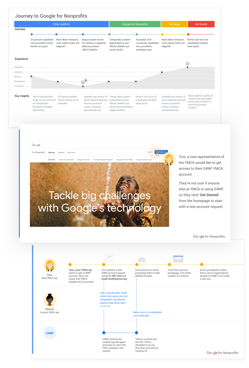
I helped the team map out the current user journey of each product’s sign up experience
While mapping out journeys, I noted potential user challenges and pitfalls. For some of the products we followed up with usability testing to more precisely observe and catalog challenges. It was eye opening for myself and the team to see the complexity of what our users experienced.I collaborated with a UX researcher to gather quantitative data
We used data collected from the Happiness Tracking Survey (HaTS), to help us map the user’s satisfaction across the Google for Nonprofits product sign up journey. With the results we could more easily see where users were feeling the most dissatisfied in their journey, helping to shape changes to the design work and overarching goals.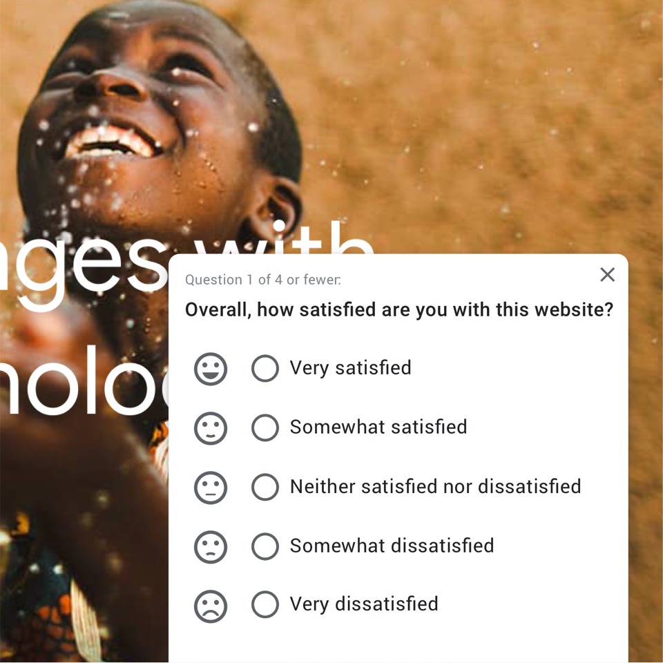
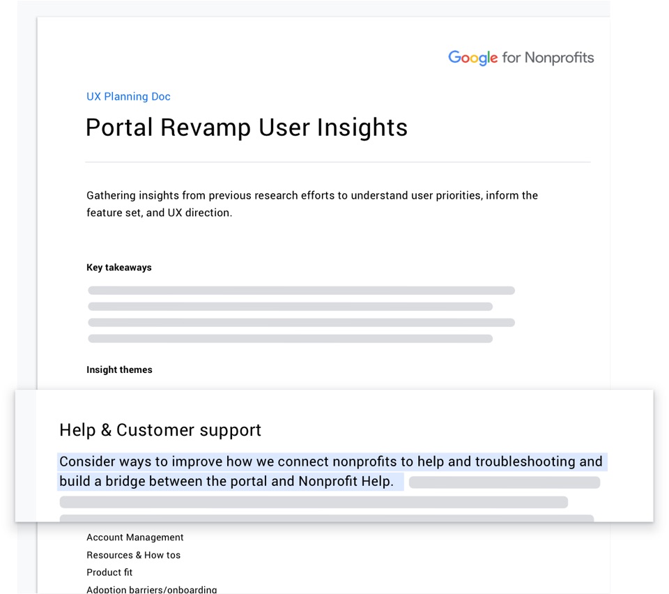
I combed through past research to gain a fuller understanding of current user challenges
I gathered key findings, mapping them to features and solutions that were being proposed.It became clear that there were areas of disconnect between what users needed now and the original design direction. We could have the most impact by shifting UX efforts towards finding more ways to help users successfully get through the sign-up process.
Gather insights from the team to
clarify & understand goals
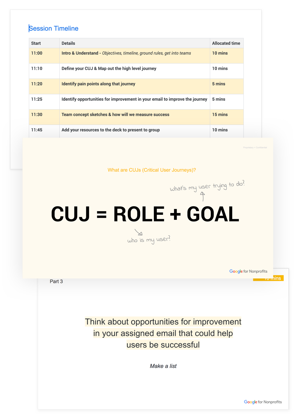
I ran brainstorm sessions and mini sprints focused on solving user challenges
Using various frameworks, like How Might We’s or Crazy Eights, the team was able to come up with new ways to approach the problem.After gathering feedback from stakeholders, I built out a central document that mapped out the objectives, accountable stakeholders, and timeline, and included links to all UX deliverables.
I also started to break up UX work items into a tracking document, to keep UX on task and help stakeholders agree on prioritization.
Bringing a team together to brainstorm with clear takeaways and a narrowed scope is a great way for UX to gather insights from stakeholders that have a unique viewpoint on the problem. It also allows the team to contribute to the UX process, and gain more empathy with our users.
Design explorations &
collecting user feedback
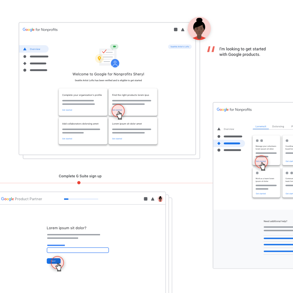
I started designing in low-fidelity to keep focus on the larger user journey
Once stakeholders and UX were clear about the challenge, I began designing low-fidelity wireframes to focus on how proposed solutions fit into the larger picture. Throughout this process I looped in product, engineering, and program to further refine and get stakeholders on board.Once the team was on board, I refined the wireframes and created high-fidelity prototypes
I started with high-fidelity wireframes and converted them into simple click-through prototypes that we ran through usability testing.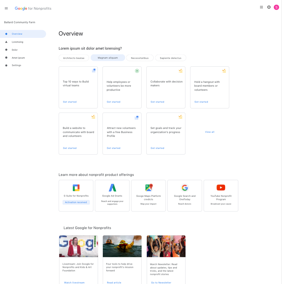
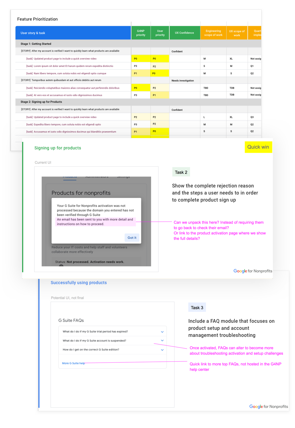
I collaborated with a UX researcher to gather user insights
I assisted with defining testing goals, preparing and observing the study, and analyzing the results. Together with UX Research we brainstormed about how to address and fix user issues.From there I worked with stakeholders to organize the findings and fixes by priority, UX confidence, and scope of work. This helped the team think about where to begin, how to break up the work, and what features could be delivered that were high impact.
Design Deliverables
Over the next three quarters, we incorporated the user research findings into several areas across the Google for Nonprofit ecosystem. Updates included revamping all email content and templates, incremental improvements to the user portal, and expanding how we communicate within the portal.
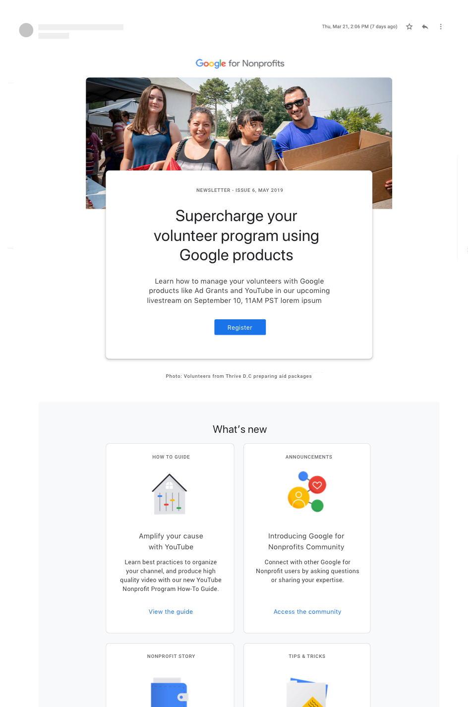
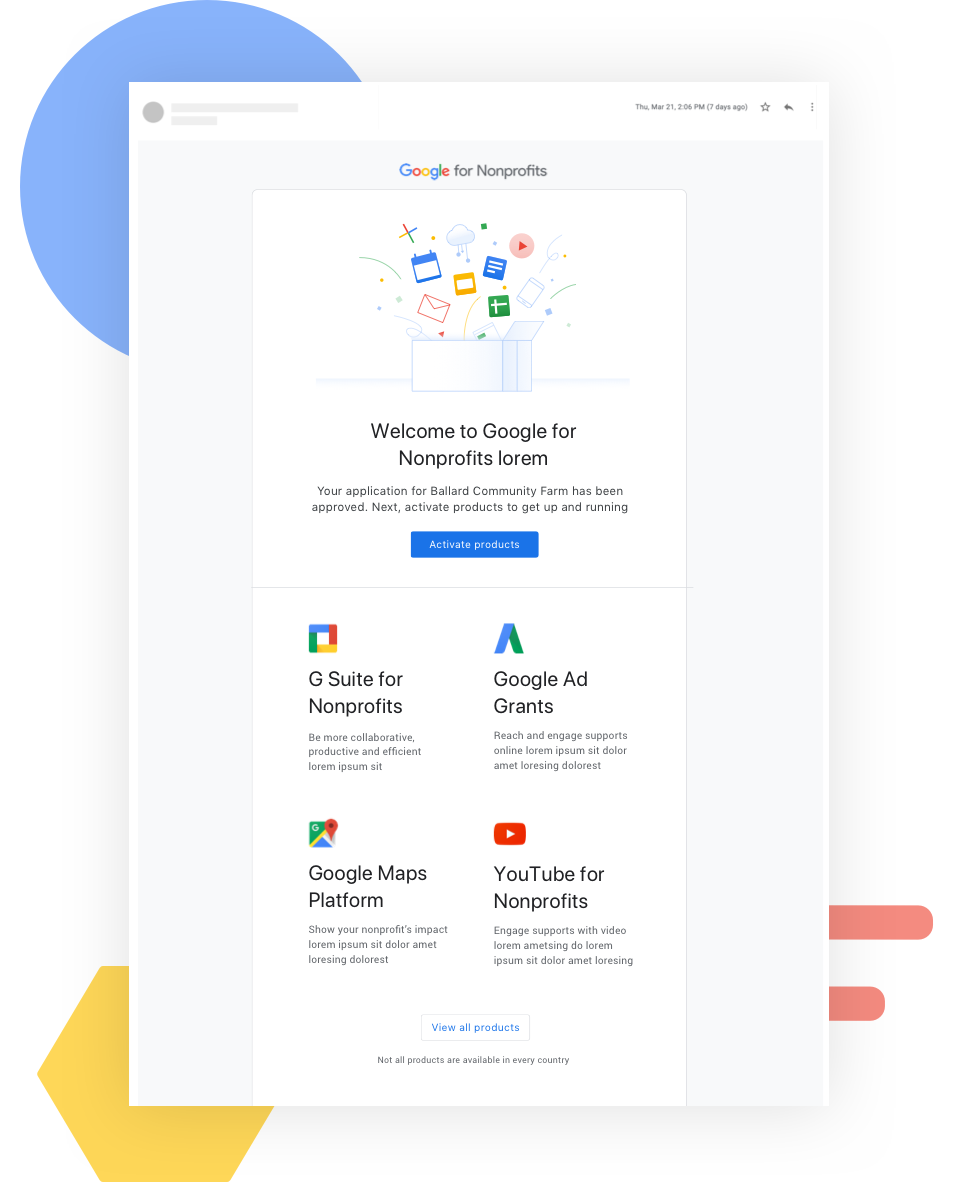
I redesigned email communications to drive users back to the portal and help them successfully sign up for products
The Welcome email, Newsletter, and all service emails sent during the sign-up process, were identified as points in our user's journey, where we could improve how we talked about our products, provide a stronger call to action, and apply researched backed email best practices.In addition, I redesigned the email template to simplify messaging, reorganize it to be more modular and mobile friendly, and aligned the visual elements to Google Material.
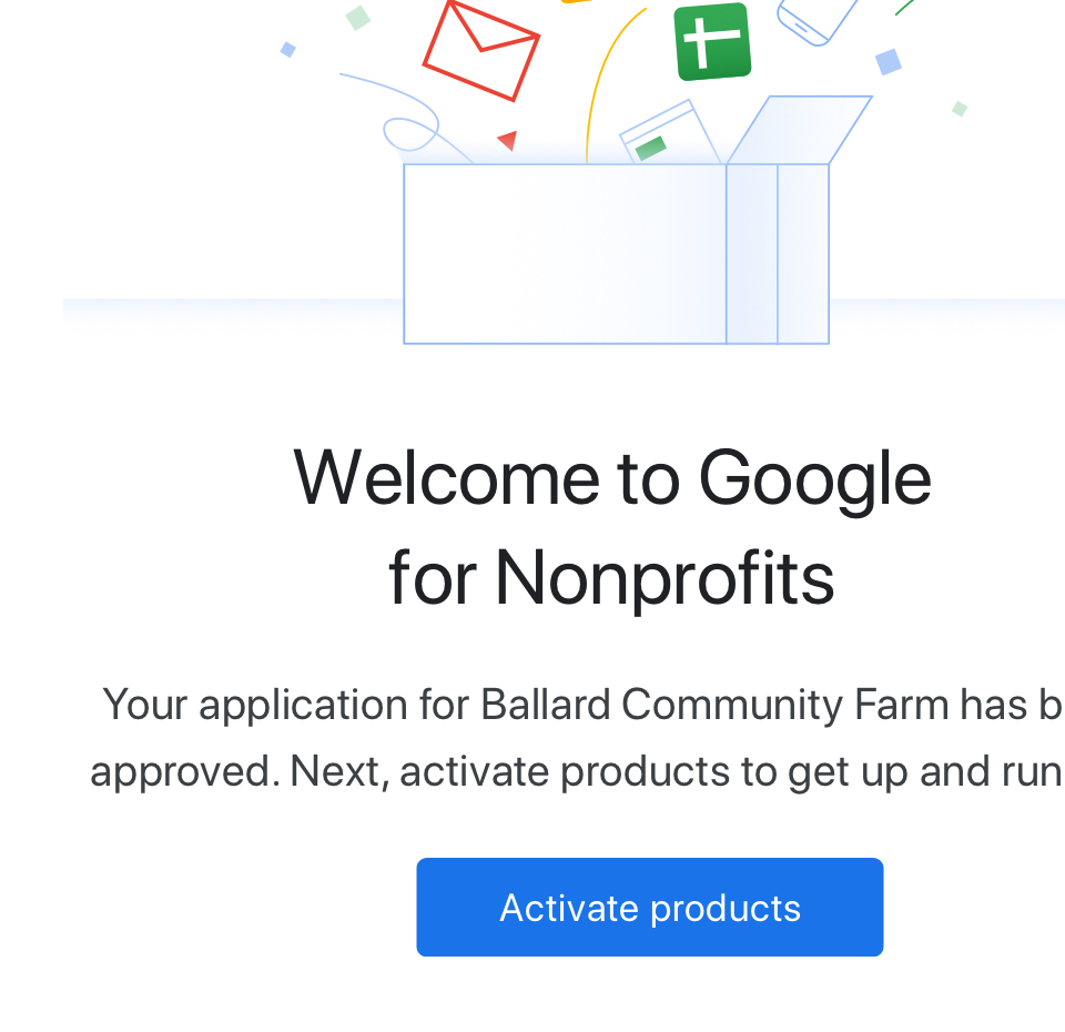 All messaging was reduced and simplified, and only included one primary call to action
in order to emphasize the next step.
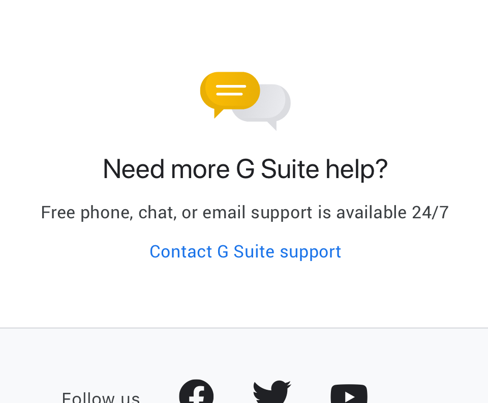 A help panel was included, to help users troubleshoot and connect with support.
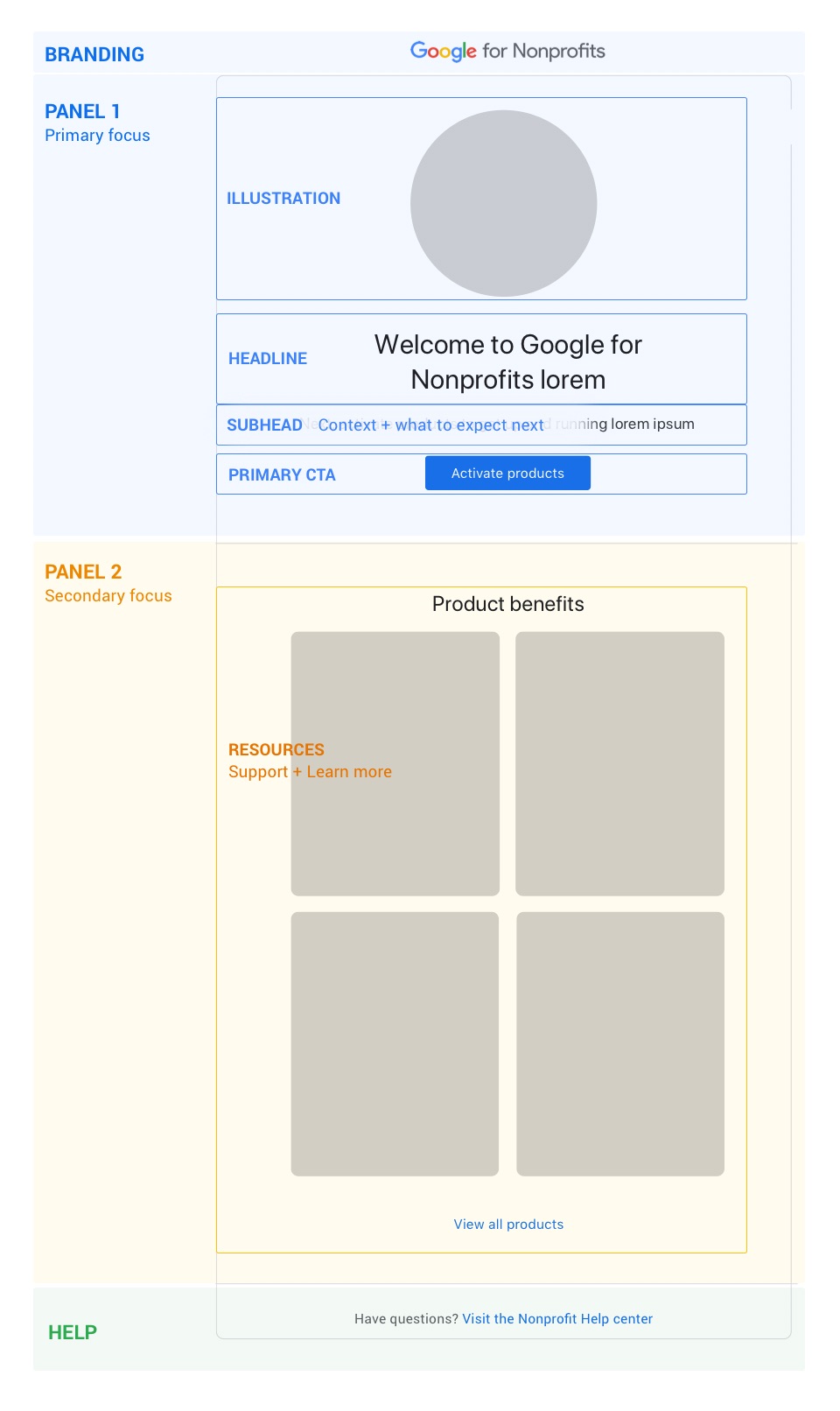 All email templates were restructured into a modular system that had one primary focus,
with additional supporting elements. The new template made it easier to break up complex
steps and better direct users.
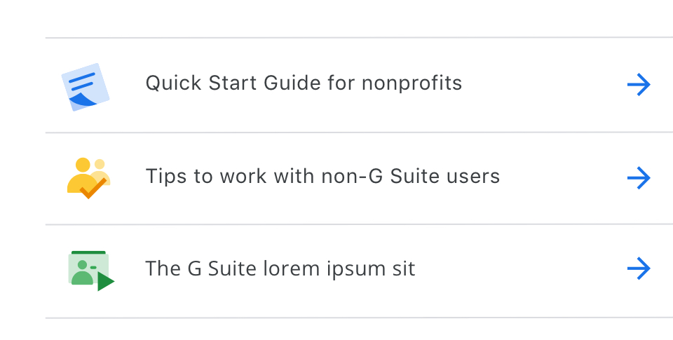 Additional information beyond the primary CTA was scaled back and reduced to a few
essential resources. They were tailored to support users in their specific stage in
their journey and to guide users to the next step.
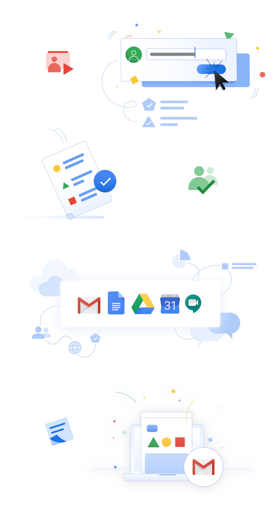 I created illustrations and iconography to bring elements of Google Material and to
visually guide users to critical information.
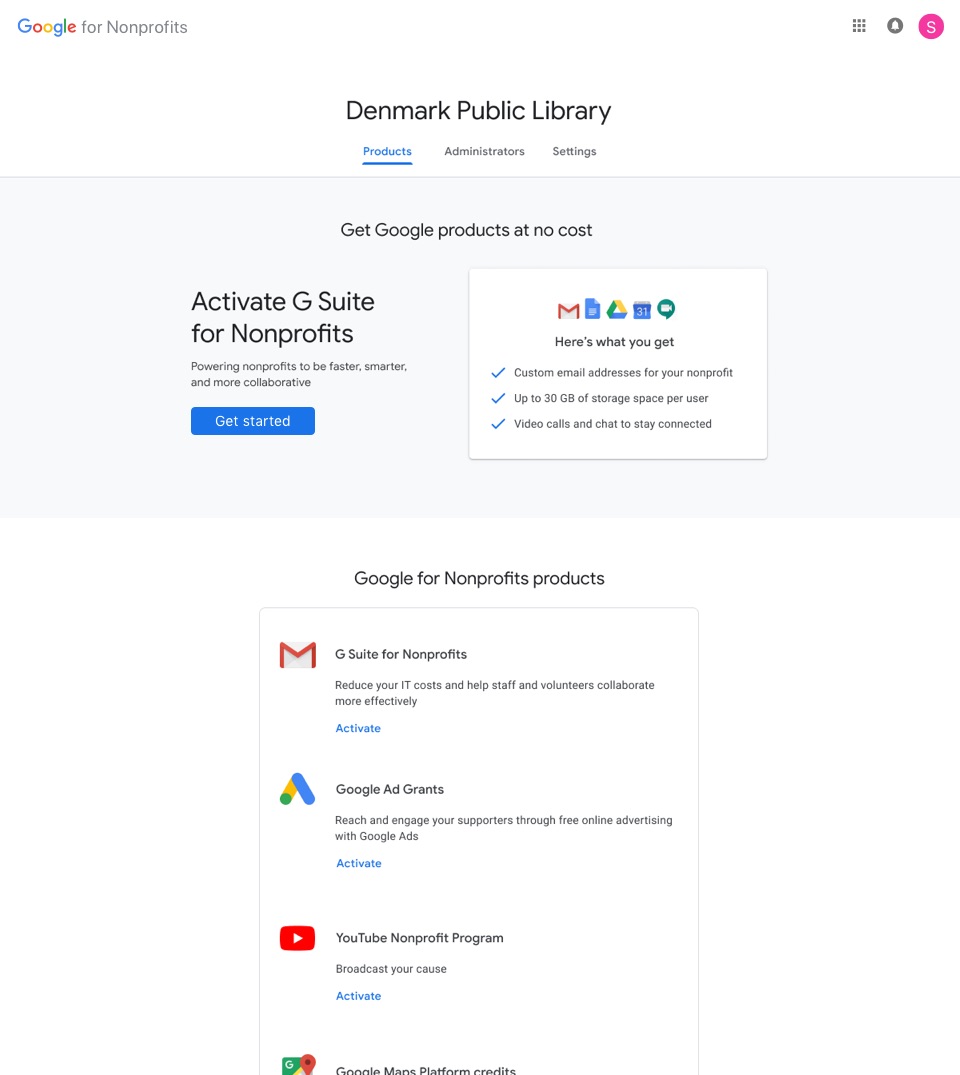
I set up A/B tests and incremental improvements to the portal
I designed incremental updates across the portal that focused on benefit based product messaging, emphasized call-to-actions, and encouraged users to begin the signup process. We also focused on surfacing resources to help users troubleshoot or get support if they got stuck during the product sign up process.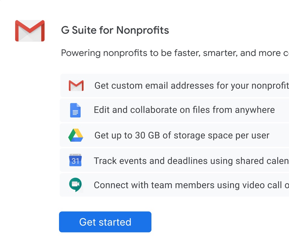 Experiments focused on benefit based product messaging to help the user better understand
product values from a nonprofit perspective.
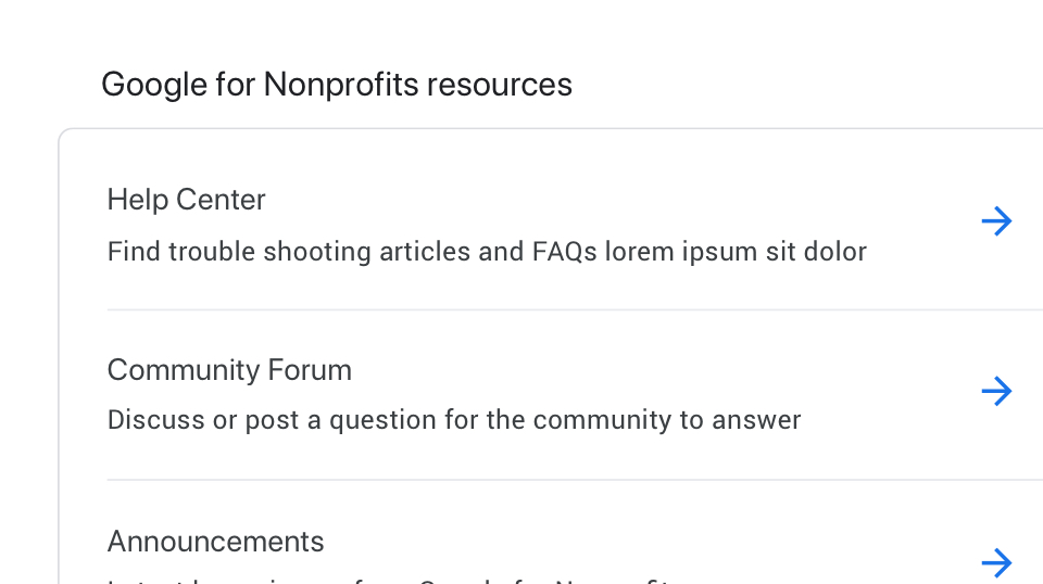 There were several sites in the Google for Nonprofits ecosystem that operated independently
from the portal, but provided relevant resources. I included a module in the portal that
quickly linked users to those resources to troubleshoot or learn more.
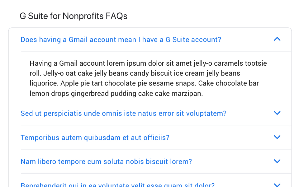 Common issues and most frequently visited help topics were surfaced in a module in the portal,
helping users better self correct encountered roadblocks.
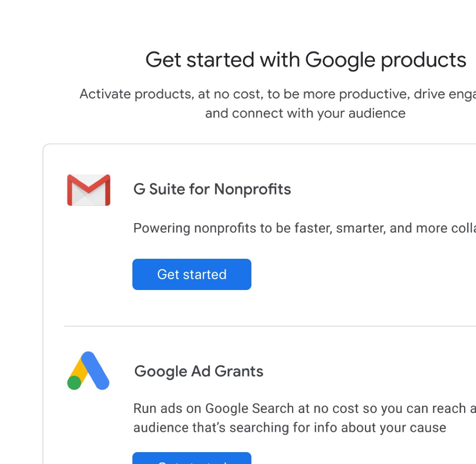 We emphasized that products were available at no cost and where to start in order to sign up.
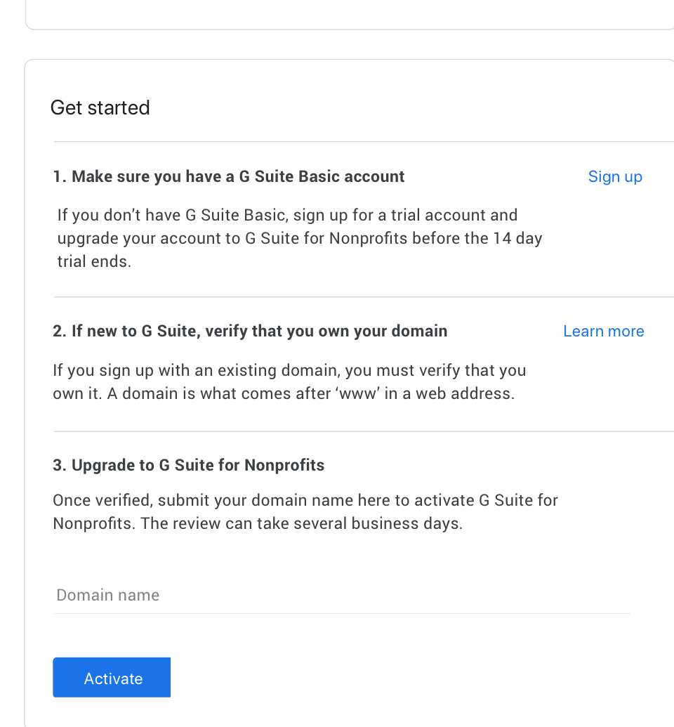 The product sign-up page in the portal was updated with an improved layout and sign-up steps
to help users understand what would be expected during the process, where they might encounter
roadblocks, and explain technical jargon.
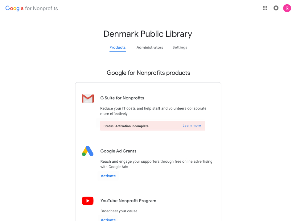
I rethought our notifications to bring clarity to errors and help direct users
I updated how and when we communicate notifications during the sign-up process. I unpacked messaging that was hidden behind tooltips or only available in emails, making it accessible in the account portal where actions needed to be taken. I also applied Google Material visual language to better help users understand severity, and worked with the program team to update all notification text to be more concise, clearly state the required action, and include less technical jargon.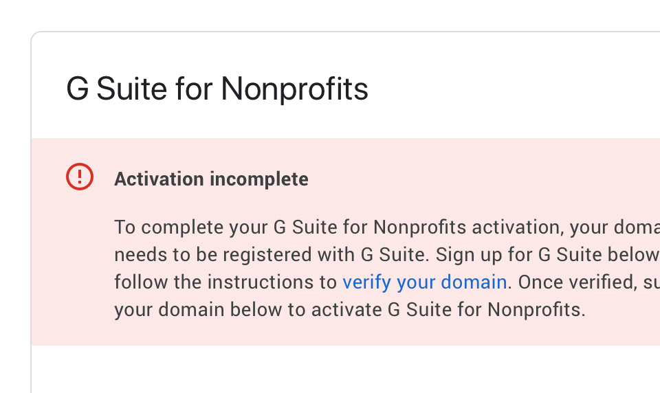 Messaging that was previously only included in emails was displayed in the portal
where action needed to be taken.
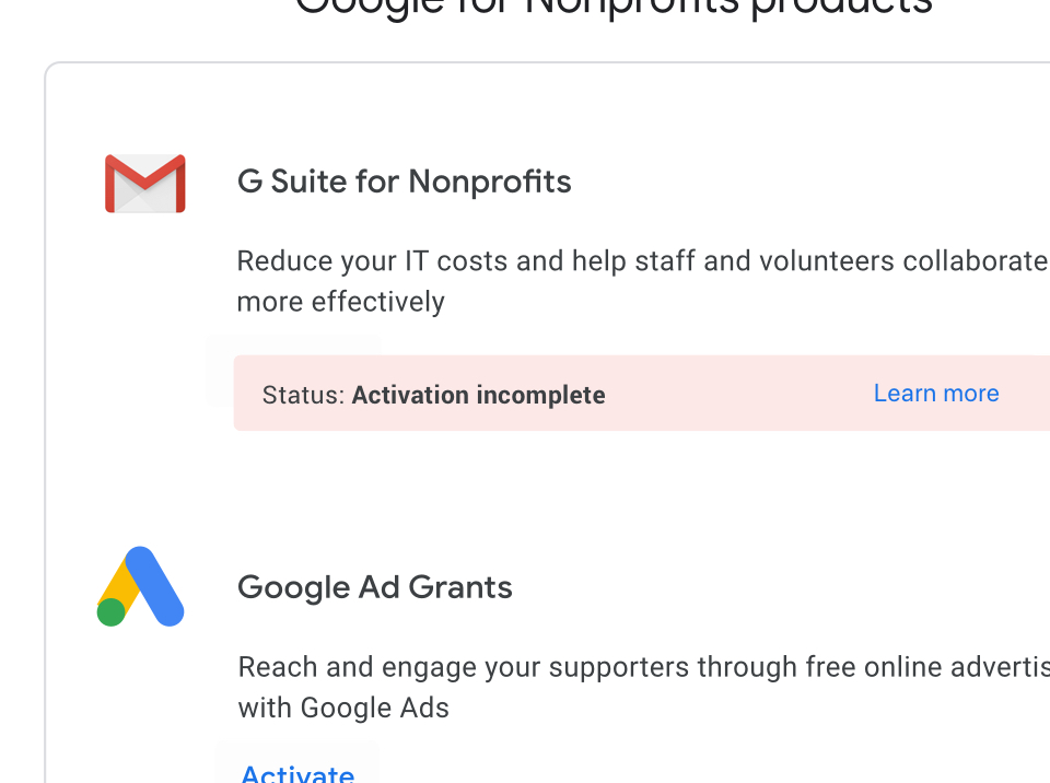 Color was included to help understand severity and guide attention.
Key Takeaways
It was imperative to shift how we thought about supporting our users, understanding that their interaction
with Google for Nonprofits varied depending on their place in their sign-up journey. We took steps to
unpack complex processes and bring clearer language and calls to action to help users more successfully
navigate the process. In addition, making small, targeted updates allowed us to solve user pain points
with a small team and limited resources.


